.png)
_edited.png)

My Role
-
UX Designer
-
UI Designer/Visual Designer
-
Brand Logo Identity
Project Type
-
End-to-end mobile application
Timeline
-
12 weeks
Tools Used
-
Figma
-
FigJam
-
Card Sorting Study
Research Goals | Competitive Analysis | Interviews | Surveys | Affinity Map | Research Insights
Research
Background
A healthy diet typically includes nutrient-dense foods from all of the major food groups, including lean proteins, whole grains, healthy fats and a variety of fruits and vegetables.
Problem
How might we create a platform that allows people to cook healthy meals and still save time?
Research Objectives
Understand what the users are looking for when planning meals for the week.
-
Understand how users begin their planning process
-
Understand the process of selecting a new recipe
-
Determine what meals people cook most often
-
Learn what pain points frustrate users the most
Competitive Analysis
As part of the research, I looked at top competitor websites to understand their target audience, strengths and weaknesses and what problem they’re trying to solve.

User Interviews
I interviewed 8 different participants to better understand their experience with weekly meal prep and how they go about selecting recipes. I wanted to understand their goals, motivations, and pain points as they went through the process.
User Goals and Motivations
-
Blog free site
-
Side dish recipes
-
Recipes that are quick to make
-
Limited ingredients
-
Recipes with options/substitutions
User Frustrations and Pain Points
-
Recipes with too many pop-ups
-
Limited time to cook
-
Unknown ingredients
-
Blogs are long and distracting
Affinity Map
_edited.png)
Key Findings
I created an affinity map to identify the patterns of thoughts and behaviors. I paid close attention to user needs and pain points, in order to determine if there were any common themes among the interview participants.
-
Dinner was the most cooked meal
-
Time was a constraint for cooking at home.
-
Users liked photos but didn’t have time for video.
-
Users needed side dishes to go with main meal
Define
User Persona | Task and User Flows
This is Anna
After reviewing the research findings, there were some very clear data points that emerged allowing me to create this primary user persona, Anna. By identifying the common goals, motivations, and frustrations among my interview participants' answers and survey responses. Anna represents someone who wants to cook meals for her family but is limited on time.

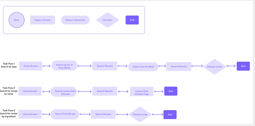
Task and User Flows
Task flows were created to show how a user would navigate using the app to search for a recipe by type, by name or by ingredients. The user flow was a little more complex because it took into account user decisions.
.png)

Design
Low Fidelity | Mid-Fidelity Wireframes | Moodboard | High-Fidelity
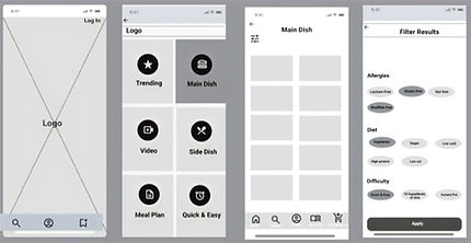
Low-Fidelity Wireframes
I used low-fidelity mock-ups, informed by initial competitor research and user interviews, to visualize the product layout and define category labels.


Mid-Fidelity Wireframes
_edited_edite.jpg)
I used Figma to turn my low-fidelity mockups into mid-fideltiy designs by adding more details and visual clarity while still being able to iterate and gather feedback.
Moodboard
I chose my visual inspiration based on my brand values; useful, productive, and convenience. I wanted a color pallet that aligned with those values and also represented growth, warmth and stability.

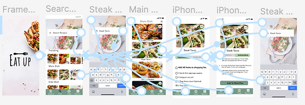
High-Fidelity Wireframes
Using the mid-fidelity wireframes and my moodboard for inspiration, I created hi-fidelity wireframes of each screen.
.png)
Prototype
Task 1
Task 2

Usability Testing | Priority Revisions
Test
I conducted interviews with 5 users between the ages of 25-55. All 5 tests were done in person with users sharing their thinking as they navigated the prototype.
Success Metrics
Low error rates, high completion rate, and user feedback and behavioural response.
Results Task #1
-
Find a main dish
-
Look at both ingredients and instructions
-
Search for a new recipe.
TF1-80% completion Rate
Most users were eventually able to complete all tasks although one had a more difficult time finding where
the main dish would be located.
Results Task #2
-
Find a side dish
-
Look at both ingredients and instructions
-
Add to meal plan
-
Pick a day to add recipe.
TF2-100% completion Rate
*Completion Time- All tasks completed well within the targets time of 3 minutes.
Average completion time was 1 min. 10 seconds.
"Loved the design and layout of the landing page: "Both the design and name are memorable and this looks like an app I would use."
Weaknesses- were there any roadblocks?
-
Some users thought they needed to login to use app
-
Some users wanted to search for a recipe
-
Some users were confused by the bottom navigation without labels
Priority Revisions
-
Removed login from the first page to reduce user confusion.
-
Revised the home page to include a search box and scroll ability to view multiple recipes.
-
Changed bottom navigation to reflect labels and changed the meal plan icon to be more uniform with the other icons. Removed home icon as it was no longer relevant.
_edited.png)
_edited.jpg)
_edited.jpg)
Conclusion
Busy people need an simple and easy way to cook meals at home.
-
EAT UP is user-friendly app that can make a positive impact on people's lives.
-
By prioritizing mobile accessibility, EAT UP can reach a wider audience and provide a more seamless user experience.
-
Offering multiple grocery ordering methods caters to users' individual preferences and needs. By accommodating a range of options, EAT UP increases the likelihood that users will continue to use the app over time.
-
Usability testing is very critical as it despells assumptions and provides data and information on how users will use the app.